Category Archives: “watercolour pencil”

back home after my UK holiday

I have returned from my one month holiday in England and Scotland. I had a wonderful holiday  and filled two and half Moleskine watercolour sketchbooks (13 x 19cm).

Squirrel meet watercolour pencil, watercolour pencil meet squirrel.

(Thanks to Mum & Jules for your patience while I waited to line up this photo)

I took my usual sketching equipment and put pencil to paper as many times a day as I could. I have so many tales to tell. However, I have not even started scanning my sketchbook pages and this will be done over the next few weeks.   While on holiday I instagrammed (alissaduke1) a sketch daily if you would like to have a glimpse of some of them. 

This week’s blog is just a little taste of things to come. 


I felt that GREEN was the colour of my holiday (although when I look through my sketchbooks, it does not feature heavily).  Specifically Grass Green (Faber Castell) ! I used this pencil so often in the UK – the grass was SO green and the trees are a different shade.

My other main green colour was Pine Green . The colours that I use in Australia, but did not use as much in the UK were Earth Green, Olive Green and also Light Yellow Ochre.


We walked through quite a few parks and looked out many train windows onto the green countryside.  Although the UK was going into autumn, the trees had only just began to change and only some leaves had fallen. 

More to come…


Blarney Books and Art Biblio Art Prize

If you have been following my art for a while you will know that I have had several projects where I have drawn in books about to be discarded.  See the end of this blog for links to my previous projects .

The current project is for entry into art competition. Blarney Books and Art are holding their annual Biblio-Art competition. The brief : create an artwork which is clearly inspired by a book you’ve known, in any medium. 

I had left over books from my Drawing in Books exhibition. I had never knew what to do with this particular book, as there were so many potential pages to draw on. For this competition I get to draw on them all ( or as many I want to) . 

My book is Teachers’ Notes on “Nature Study: Plants and Animals” published 1910 by Blackie & Son Limited in London and Glasgow.  hardcover, 233 pages. 11.5 cm x 18.5 cm .

Purchased at Kyneton Church Book Sale in a bag of books. Stamped inside book Mary L Norman, The Studio, Ararat . Inscription in pen C.E.G.S 1920

Reading the teacher notes for this 1910 book is fascinating, It is amazing how many lessons require a live object and also the way they incorporate English and Maths into the Science lesson.


I have drawn in watercolour pencil on 43 pages so far, illustrating the animal or plant on discussed on the pages. This blog post has just a few of those I have done so far. I will put them all into a Flickr album over the next two weeks . It has been great fun to illustrate, as I am under no pressure, doing simple drawings. The print on the page takes away the need to go into too much detail in the drawing.The paper of the pages are a decent weight, so it takes the pencil well, but stops me doing too much. 

I have another three weeks before I need to submit my entry. Up to sixty selected entries will be chosen for display before judges make decisions. All works are for sale (including this one!) .


My previous “drawing in books”

The first was an exhibition You Can’t Draw in Books as part of Melbourne Rare Book Week in 2016. This exhibition was also shown at East Melbourne Library  and Blarney Books and Art in Port Fairy. some of the drawings are here . There are some of them available for purchase on my ETSY online store 

I drew in a recipe book as a special birthday gift for a friend.  see all the pages here.

I will be adding more of these pages to my flicker website…

the watercolour pencils I use

Last week I drew (in watercolour pencil) the watercolour pencils that I have in the sketchkit that I carry with me everyday. I carry 26  colours that I like and which suit what I draw and my style. There are over 120 colours in the FaberCastell Albrecht Durer watercolour pencil range. I do not own them all and have built up my collection over time.

I knew that I had drawn my pencils previously and was curious to see which colours had changed over time. I know that the vast majority have stayed that same and was aware that a few had been changed along the way . My drawings were from 2013. 2016 and 2018. They were drawn as part of my pre holiday packing. 


Looking back, I see that I have not swapped too many colours over the past 5 years. I have put an asterisk next to those few that I am not as pedantic about. There are often a few variations on colour in the range and for some of these I am happy to use whatever spare I have in my pencil box at home or can buy at the art shop. 

Here is a long list of the Faber Castell Albrecht Durer watercolour pencils I carry with me. There are two Derwent watercolour pencils and I use them as I cannot get the same colour in FaberCastell. Sometimes the names of colours are changed, which makes life a little confusing. I think Light Orange used to be Orange Glaze.

I have put some quick notes about how or why I use these particular colours. These are a personal choice.

Ivory – I use this all the time – buildings, food, often useful when something is not white
Light chrome yellow * there are a few yellows I could use
Light Orange – not used often, but a lovely real orange 
Scarlet red * it is an orangey-red. There are a few different colours I could use 
Magenta – useful for iron lace of buildings
Venetian Red – great for buildings. I used this a lot in my 2016 visit to Manchester . I also used Indian Red there 
Madder Carmine (Derwent) – a real red
Pink madder lake – don’t use often, but it is a real pink
Blue violet * handy to have but I could easily use another colour
Indanthrene blue – I use for shadows, skies, darkening area of a page. I just really like this colour
Ultramarine – so handy for everything
Skyblue – a lovely sky colour on the page, but turns grey when water is added. Good for skies of Melbourne 
Grass green – that hint of bright green in grass, trees
Chrome oxide green  – trees, iron lace of buildings. very useful
Mineral Green (Derwent) – a real green
Earth green – a wonderful colour for Australian – trees, 
Light flesh –for a hint of flesh tone on a face or limbs. often combined with a hint of one of the brown colours below
Cold grey IV – often used for many reasons
Warm Grey II – good for buildings – I bought this when I moved to Melbourne, as the Sydney sandstone was a very yellow colour 
Payne’s grey – I use this a lot 
Black – not often, but very useful
Dark sepia – I have recently discovered and love this colour 
Light yellow ochre This colour and the rest of the list I often use together. I draw a lot of nature objects and food, coffee. I can build up a lot of depth in an object using a combination of these colours. 
Burnt ochre
Brown ochre
Raw umber
Burnt umber
Burnt siena
Walnut brown

I will probably change a few when I visit the UK in September to suit the buildings and greens of the UK, 


What are your favourites in your sketchkit ?

motorbike and egg on toast

Two sketches from this week, showing two ways of using watercolour pencils. 

This sketch of a motorbike was done in five minutes, well actually six.

I arrived at the Post Office five minutes before it opened, so I knew that I had five minutes to sketch, There were places to sit and I very quickly decided to draw the motorbike, instead of the small queue of people waiting, or the crane across the road.  I took out the two pencils I would need  – black and  red. I put down some very quick marks down with the black to get all the shapes in place, the started with the left-wing mirror. (I think) I worked left to right and down the page, I stayed just one minute after the Post Office opened to add some final hard lines – the tyres, the front lights and windshield. I decided not to add any water.

Faber Castell colours used: 

  • Schwarz Black
  • Scarlet Red


My dinner was an egg on toast. It looked do delicious and I obviously wasn’t that hungry as I drew it before starting to eat. About two third was done from real life and the final details from my head. These included the detail on the toast and adding extra depth of colour to some parts of the egg yolk. You can get a lot of depth and colour from watercolour pencils by building up layers. It requires a little patience to allow the paper to dry before adding the next colour. 

Faber Castell Colours used

  • Light Orange
  • Light Chrome Yellow
  • Light Yellow Ochre
  • Cool Grey IV
  • Payne’s Grey
  • Walnut Brown
  • Burnt Umber
  • Brown Ochre
  • Burnt Ochre

Happy sketching !

Australia Day 2018

My traditional drawing on Australia Day – Vegemite on toast. 


This year I added some gumleaves (not for eating) to the page. The gumleaves were picked up off the ground in Treasury Gardens yesterday. They will dry and lose their colour over the next few days. 

I drew the leaves last night knowing that I was going to include some sort of food. 

Lamingtons? Meat pie? Pavlova ? No – I added the vegemite on toast this morning of Australia Day .  It was cold by the time I got to eat it. 

Australia Day is a national public holiday. Celebrated annually on 26 January, it marks the anniversary of the 1788 arrival of the First Fleet of British Ships at Port Jackson, New South Wales. With community festivals, concerts and citizenship ceremonies, fireworks, music  and barbecues the day is celebrated around the nation.


Sketching at concerts

This week I went to two classical music concerts in libraries and sketched at each . Both concerts were beautiful and I am in awe of the skill of the musicians and performers . They were:

I am most pleased with the above sketch of Saverio , at the second concert I attended. Perhaps I had warmed up my sketching the night before. I think I may have been a bit self conscious at the first (Bottled Snail) concert, as it was held in my workplace and a few people know that I was sketching,

Habeas Chorus of Bottled Snail at Supreme Court Library. They were warming up just before the concert began

I have sketched irregularly at classic (and other) music concerts over  the past few years. It is something that I enjoy, but don’t feel in my comfort zone. I often draw people in groups, audiences or events, but for some reason I am not entirely happy with the results of musicians.

Sketching while listening to music enhances my appreciation and relaxation.  However, it all depends on the music. Sometimes  I will put my pencil down, close my eyes and soak it all in.

I have been reflecting about why I don’t have the same level of comfort as in other situations. I don’t have the answers but I think I know why I don’t have the answers,

One thing I have learnt – each situation is different – indoors, outdoors, amount of lighting, size of audience, number of musicians and how many musical pieces and the length of the pieces.  Sometimes I can choose where I get a seat but not always. There are often unknowns.


Choosing pen and ink to sketch the highlight of the black and white of the choir , the outline of the audience members. Adding colour to the Chief Justice’s portrait and the gasolier lamp.


I know that I need to make an early decision on what to draw with. I need to decide whether to choose my Lamy Safari ink pen or one or a few choice watercolour pencils. I then put everything else away. I don’t want to be disturbing and distracting other audience members by fiddling around, looking for colours. 

Although listening to a concert is an audible experience, there is often so much visual.

One of the decisions I think that I need to make is about what to focus on and put down on paper. Are they sketchy or detailed ? Often this depends on my mood. 

Do I want to capture 

  • The feeling of the music
  • Musicians – faces, feet, hands, their movement
  • Instruments
  • Audience
  • Surroundings – the building, stage

I will try to think of them as a suite of options open to me.

At the moment I think that I try to capture it all. Some concerts are only 45 minutes, some much longer and will have a few different sets of musicians playing .


an even quicker sketch. The music ended

I know that I had seven minutes to sketch Kylie, the accompanist.

another quick sketch

greeting cards – from sketch to store

Very early in September I started drawing my next range of greeting cards, which would include some Christmas cards and also some drawn of the Supreme Court of Victoria and its architectural features. In hindsight I should have started a lot earlier as I have felt a bit of pressure to get these done to be ready for the Christmas season.

I am going to take you on the journey from an idea sketch to the printed card that can be purchased in stores. I am using my Koala and Gumnut Blossoms as an example.


After deciding to draw Australian animals on Christmas card I had the ‘lightbulb’ moment of including red and green in the gumnut blossoms. The design grew from there, 

I decided on five new cards and had the final drawings completed in watercolour pencil on A4 watercolour paper by the end of September. 

At the same time I reordered some of my previous card designs as stocks were getting low and Christmas is coming up and I have a stall at a big market at Etsy Made Local Melbourne in late November. Before sending my order to the local printing company for my new designs to be scanned and cards printed , I had to decide how many to print of each.  I was very fortunate to have two of local stockists Law Institute of Victoria bookshop and Paperpoint stationery  preorder 10 of some of my cards, including the Christmas koala and possum. I decided on 70 of each . Altogether I ordered 500 cards. 

I dropped my originals off to the printer on 25 September and received the cards on 18 October.  The timeframe was so long because I had received one set of hardcopy proofs to approve but I wanted to change the colour balance on some of them. I was then  sent another set of hardcopy proofs which I approved . Hence the delay. 

In the meantime I ordered 500 envelopes from my usual local stationery store and 500 cello bags to put each card in.

Saturday afternoon on my lounge chair’

Top Row : cello bags, cards, envelopes

Bottom Row: cards in cello bags with envelopes, strips from cello bags .

(hint learned from google searching. Put stickytape sticky side up on put cello strips on this. Otherwise they are full of static and stick to everything and anything . This keeps them in one place. )

They took all afternoon to package. But it was a nice way to occupy a chilly Melbourne Saturday afternoon. 

Today, Sunday, I took some very basic photographs so that I could put my greeting cards for sale on my Etsy online store. This also involves writing descriptions  and choosing keyword tags.  I will need to take  better photographs to showcase the cards. But the aim today was just to get them up online.

Easter weekend in Sydney

Last weekend I visited Sydney. It was my second visit since I moved to Melbourne two and a half years ago. I had lived in Sydney for ten years and made many good friends there, especially in the sketching world. 

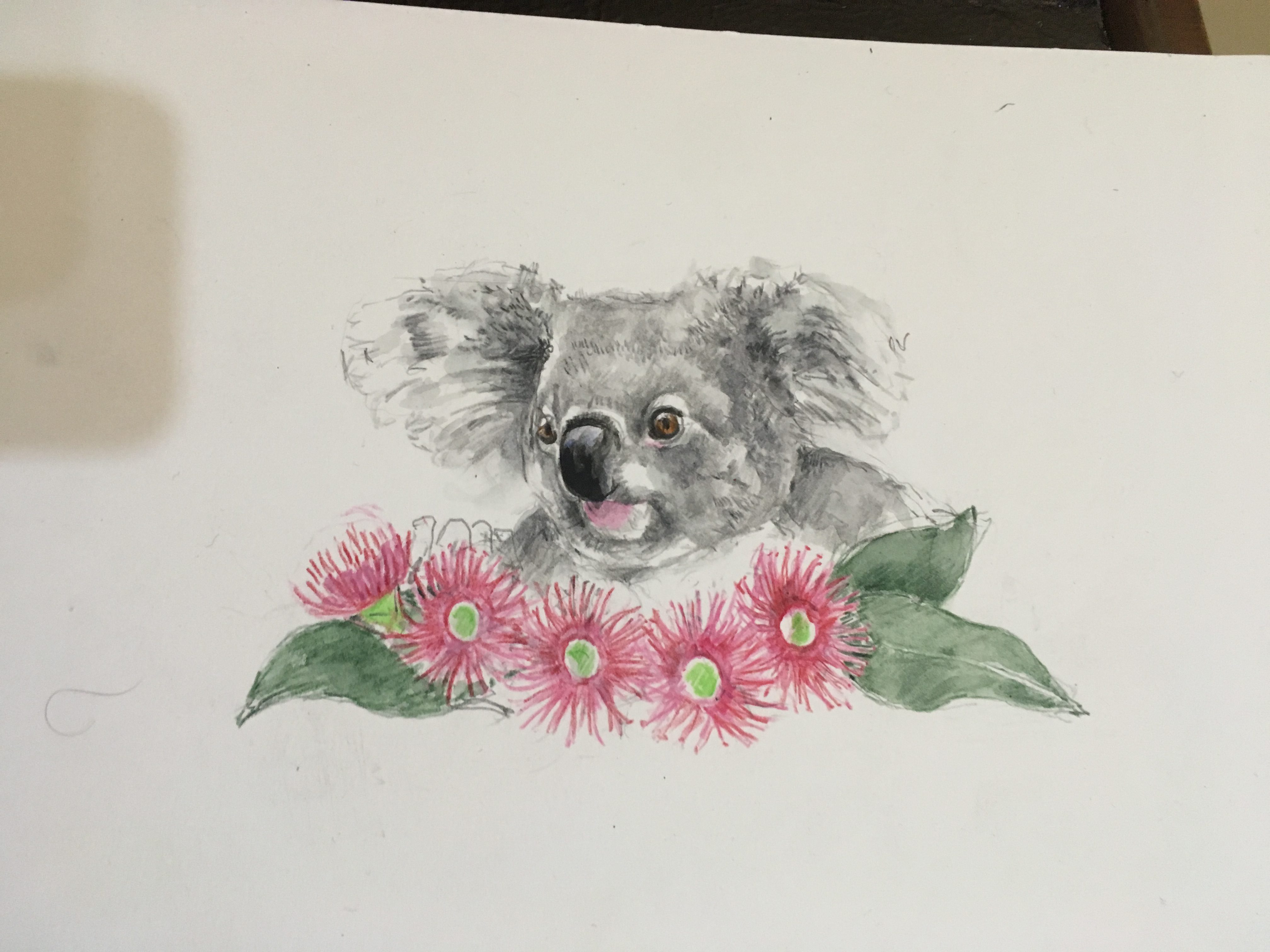
I planned my visit to spend some quality time with friends, and I did, I had some lovely conversations and sketching time. It was definitely a sketching holiday and so relaxing. I filled twenty five pages of my Moleskine watercolour sketchbook (13 x 19) over the four day break.

I’ve included a few on this blog. If you would like to see them all they are on my flickr site from 13 to 17 April 2017.

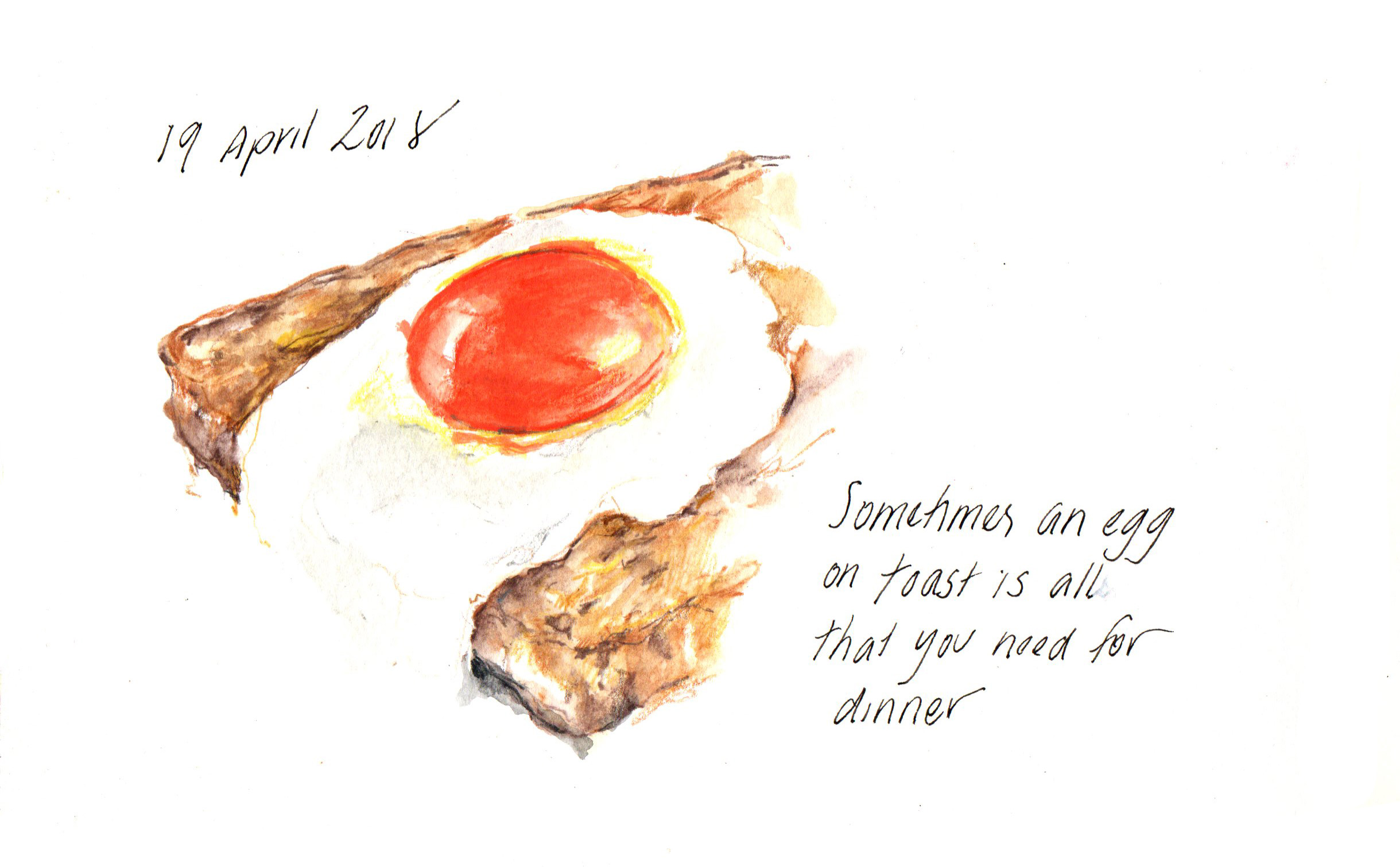
I started sketching as soon as I left work on Thursday and was officially ‘on holidays’ – on the bus to the airport, at the airport. I sketched the view from where I stayed each night, food I ate and scenes along the way.  Some sketches are in ink and some in watercolour pencil and some a combination of both . Sometimes I can visualise what I would like a sketch to look like on the page, and I “know” (inside) that it will work in pen rather than watercolour pencil. On another day or another time I may have chosen different material. 

I am usually very happy with what i put on the page. Every now and then I am exceptionally pleased. I felt that this sketch of the cruise ship in Sydney Harbour really came together when I added the figures, The Sydney Opera House is in the background and it is a temptation to make it the focus.  However it did not fit on the page, so my decision was made.

I like to combine a feature of a building and the larger building to give it some context. This is beautiful The Russell Hotel  where I stayed on Thursday night.  I could spend some time on the interior, as I was leisurely eating my breakfast, and not meeting Chris and Liz til 10 am.  I tried not to get caught up in the detail of the staircase, The exterior sketch was done quickly, as once again I did not want to get caught up in the detail. I have been trying to figure out which room I was in and where I sketched from the Sitting Room Balcony, but it is a confusing building inside, with little staircases and rooms everywhere. 

Catching the ferry to Manly from Circular Quay. I sat on the top deck at the back. I watched as the city disappeared into the distance. This couple sat for a short amount of time on the bench in front of me. I got the lines of their heads and his arm down very quickly on the page, and was really pleased with the flow of the lines and getting their position down on the page. I can look at this and feel where his weight is and how she turns her head,. I ,quickly added some colour with my watercolour pencils, which was just as well, as they moved. I decided not to add the colour of the sky and water. 

Classic Manly on Easter Sunday. The Manly ferry , the coastal pine trees and Easter Eggs.

I sketched with about 12 few of Erin’s sketchers at Manly. I had met two when I was in Sydney, and had a lovely time chatting and sketching with them all. 

and home again. 

At the airport I decided   – no more sketching – (I did have a book to read) UNLESS I sat behind someone with fantastic hair, There was no one on the plane – but on the bus, there was a young girl with wonderfully braided hair AND bunny ears. How could I resist???? I’ve never drawn braids before and it was a  challenge ! It keep me very busy on the way into Melbourne city. Once I figured out the pattern, I could continue it while I waited for another bus.

I hope you have enjoyed my holiday. 

Please let me know if you have any questions about my sketching, using watercolour pencils, or my sketchbook journalling. I love to share my passion/obsession with sketching and the joys of watercolour pencils. 


Urban sketchers in Ivanhoe

About 30 people from  Urban Sketchers Melbourne  met at Hatch Contemporary Art Space in Ivanhoe, Melbourne at 11am, then once again at 1pm after the sketch to share. This event is part of 2016 Pinpoint Contemporary Art Fair held by Banyule City Council. We sketched for the morning on postcard size paper (and some larger) on location in Ivanhoe. group

The sketchers included Lionel King visiting from Sydney and a few newcomers, including Colin, a local, who could give us local knowledge of where to sketch – a big thank you !
It was very surreal to be with Angela Williams, Alf Green and Lionel King, as the last time we were in one place together was in Manchester, UK in July this year for the Urban Sketching Symposium.

img_2215

looking down a driveway/laneway near Upper Heidelberg Road

img_2222

War Memorial on Upper Heidelberg Road

Above are my two postcards from the morning.

img_2216 img_2218

The sketches were laid out on the tables at Hatch, as we chatted and enjoyed their hospitality of tea, coffee and biscuits !
img_2219 img_2225 img_2228

The finished “Postcards from Banyule” were then put in a display cabinet at the Ivanhoe Train Station (work will be displayed for 2 weeks).It is in the area where people buy their ticket or shelter from the weather, so should get a lot of people looking at them. (Ivanhoe is a suburb in the City Council district of Banyule).

Sketching Mum’s favourite London

I have almost finished scanning and uploading my three UK holiday sketchbooks to my flickr website. Every sketch holds a memory of a time and place and I feel like I want to show you them all. These blogs have been more of a ‘holiday snaps’ than art talk. I did not know where to start and stop sharing my English holiday sketches on my blog.

However, my mother (and travelling companion) has recently mentioned a few places and events that express what London means to her.  I have taken her suggestions to form the basis of my blog this week.

dscn8147

Mum & I in Regents Park, London

I have taken Mum’s words and added my sketch

5aug2016-bloomsbury

  •  the green spaces, so many lovely squares. We were using our Oyster Card just like all the locals and other tourists – Russell Square, King’s Cross, Jubilee Line, Westminster!!!!

7aug2016-british-museum2

10aug2016-british-museum

the places to visit like British Museum and Library


6aug2016-regents-park

  • then there is beautiful Regents Park, an oasis in the busy streets around Baker Street. Pity we had a little trouble finding our way back to Bloomsbury

12aug2016-holborn-post-box

  • London is the red buses, telephone boxes and post boxes

12aug2016-st-clement-danes

  • not forgetting that time we sat eating lunch after hearing the ‘Bells of St. Clements’

12aug2016-royal-courts-of-justice

  • and looking down the street at the Royal Courts of Justice.

London is all that and more……………